Widget template
Widget templates are predefined widgets that let you easily place the information you want on a dashboard. You can quickly build dashboards by selecting the template that fits your purpose from multiple options, including metrics widgets. This document explains the concept of widget templates and the types provided.
Flex boards let you build dashboards with widgets to visualize and link all data for monitoring targets. After selecting a dashboard in the Integrated Flex Board or Flex Board menu and moving to Edit Mode, you can check available widgets in Widget templates.
- Integrated Flex Board: you can choose widgets for all product types in projects you belong to
- Flex Board: you can choose only widgets for the product types of that project
| Integrated Flex Board | Flex Board |
|---|---|
|
|
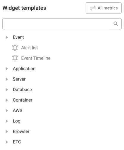
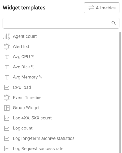
Available widgets in Widget templates may differ by a project’s product type.
-
For details on common options in the top right of a widget, see the product specific Flex board > Managing widgets document.
-
Widget features may be limited by member permission. For details, see the Project structure and member permissions document.
Graph widgets
Visualize change over time or relationships between metrics to see performance change, distribution, and comparisons at a glance.
 Time series
The time series chart widget is the basic chart for checking metric change over time.
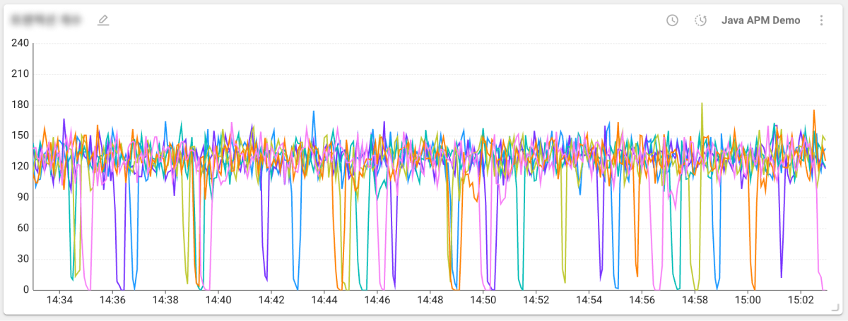
The time series chart widget can compare with a previous time.
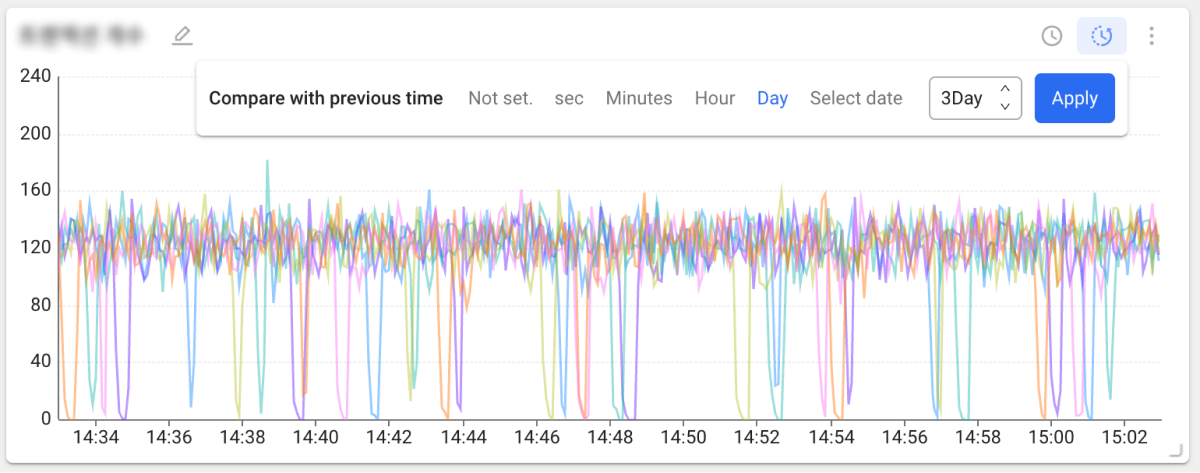
-
Click the
 icon in the top right of the widget.
 -
Set the time unit you want and click the Apply button. When you hover the mouse pointer over the chart, you can check comparison data in a tooltip.
Compare with previous time is not provided by every widget and is available only in Edit Mode.
- For details on data merge options, see the product specific Flex board > Managing widgets document.
 Top N time series
This widget shows metric change over time and metric rankings for monitoring targets.
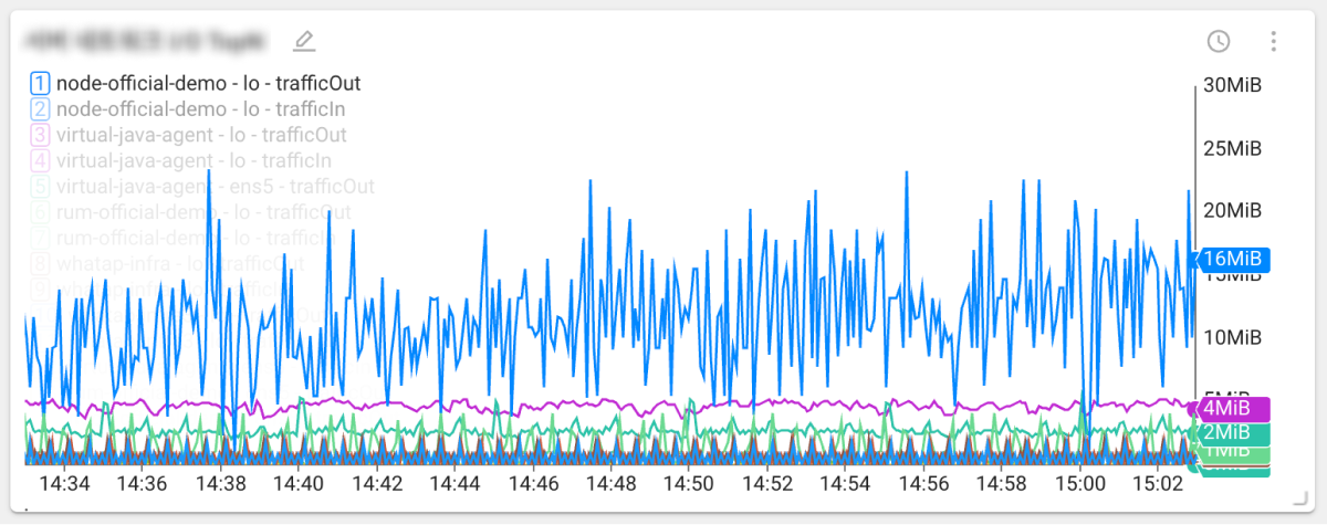
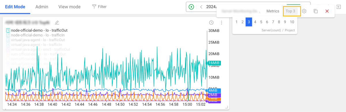
You can set the number of top N items to display in the chart.
-
In Edit Mode, click the more icon (
 ) in the top right of the widget.
 -
Click TopN and choose how many top N items to display.
 Apdex
Apdex
The Application Performance Index (Apdex) widget shows application performance metrics.
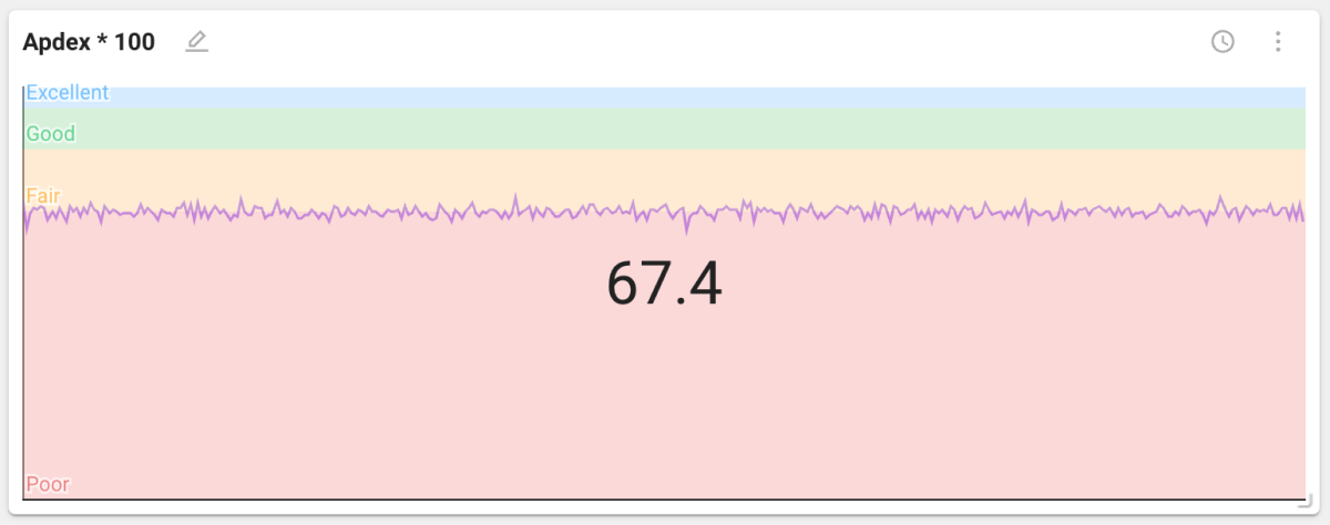
The Apdex widget is available in the application monitoring product family.
 Pie
Pie
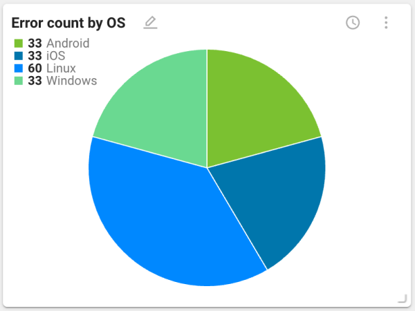
This pie chart widget is useful for checking composition ratios against the whole of collected data. You can check values such as CPU and memory usage and error counts.
 Hitmap
The Hitmap widget shows a distribution of response times for completed transactions.
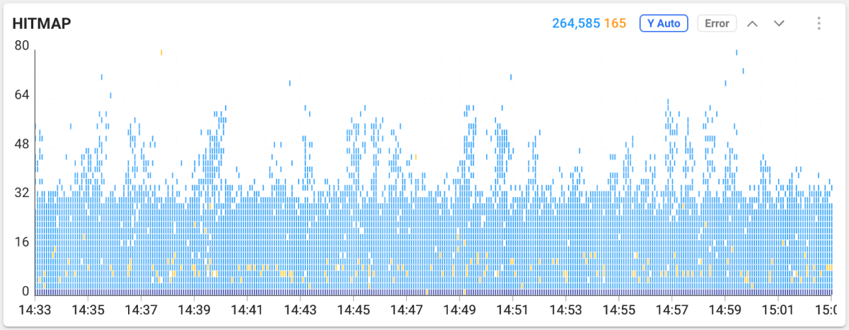
The horizontal axis is transaction end time and the vertical axis is execution time. Transactions with longer execution time are located at the top of the distribution. When you drag within the chart area in Hitmap, the Trace analysis window appears where you can check detailed transaction information.
The horizontal axis is end time and the vertical axis is execution time. Drag in the chart area to open the Trace analysis window for detailed transactions.
The Hitmap widget is available in the application monitoring product family.
 Bar
Bar
This bar chart widget is useful for comparing the status of data collected from monitoring targets.
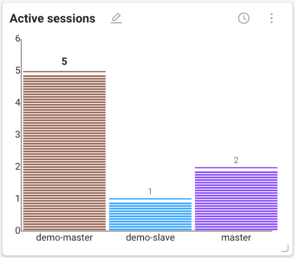
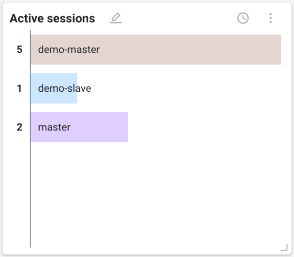
A vertical bar chart is provided by default, but you can switch to a horizontal layout. In Edit Mode, click the more button () in the top right of the widget, then click the  button.
 Arc equalizer
This arc equalizer chart widget visualizes and compares transaction status by agent for monitoring targets.
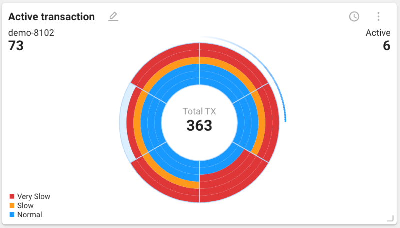
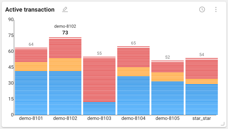
An arc equalizer chart is provided by default, but you can switch to a vertical bar chart. In Edit Mode, click the more button () in the top right of the widget, then click the button.
The arc equalizer chart widget is available in the application monitoring product family.
 Treemap
This widget visualizes server disk or memory usage. Each block’s size and color indicate usage and status.
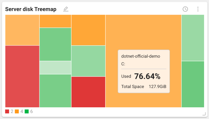
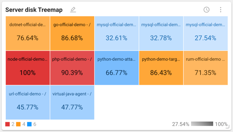
When you hover the mouse pointer over blocks in the default chart, a tooltip shows that block’s value. To switch to a chart that displays values inside each block, click the more button () in the top right of the widget, then click the  button.
 Scatter
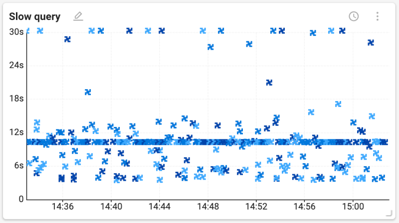
A scatter plot visualizes the relationship between two variables. Each point represents a data point. It is useful for identifying patterns or trends in large datasets and for visually checking how data points are distributed. You can identify performance issues that occur at specific times.
-
The x axis represents time and shows when the data point was recorded.
-
The y axis represents processing time and shows how long the data point took.
-
Drag a region of the chart to view details.
 Geomap
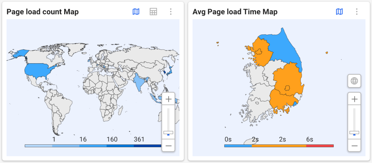
This map chart widget visualizes spatial data. By combining data values with geographic locations, it helps you identify and analyze regional performance differences.
-
Use the mouse wheel or the slider to zoom in or out.
-
To view the world map, select the
 button. You can select a specific country to check regional data.
 -
To view the data in a table, select the
 button. To return to the map view, select the button.
 -
For regional maps, data is displayed by top level administrative divisions. (Korea: provinces and metropolitan cities)
This site or product includes IP2Location LITE data available from https://lite.ip2location.com.
 Speed chart
The Speed chart widget visualizes the speed of active transactions that occur on the monitoring target. It shows the performance status of the monitoring target and is useful for analyzing performance metrics such as request processing time and response time.
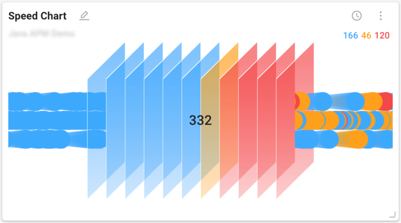
The Speed chart widget is available in the application monitoring product family.
 Honeycomb
This honeycomb chart widget shows performance and stability for monitoring targets. Each color indicates performance and stability. Blue means normal. Orange means warning. Red means slow. Gray means disabled.
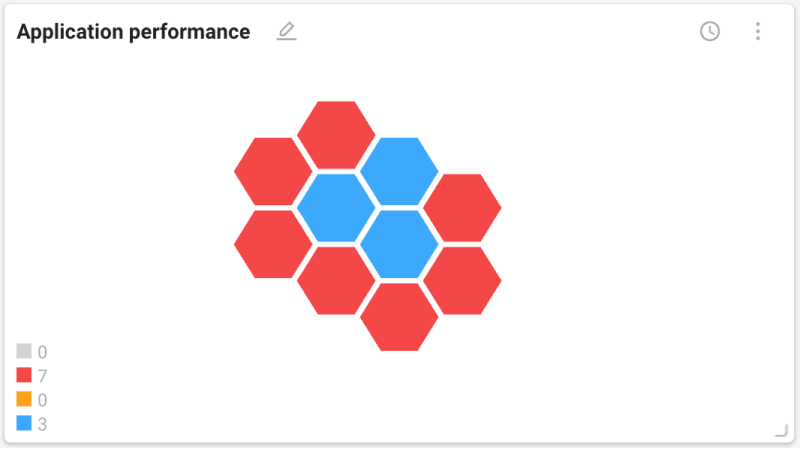
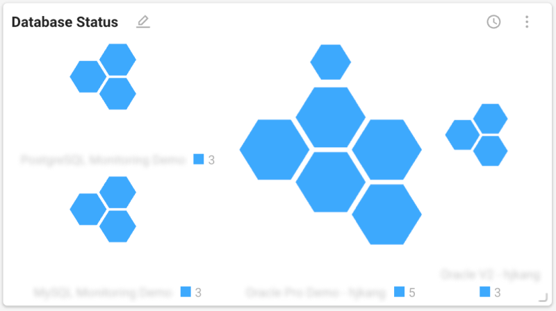
Collected data types and color meaning can differ by monitoring product family.
List widgets
Table
This widget displays a list in table form. It is useful for checking values and status of data collected from different monitoring targets. For each listed item, you can check additional related information through columns. Text color in the list indicates performance status.
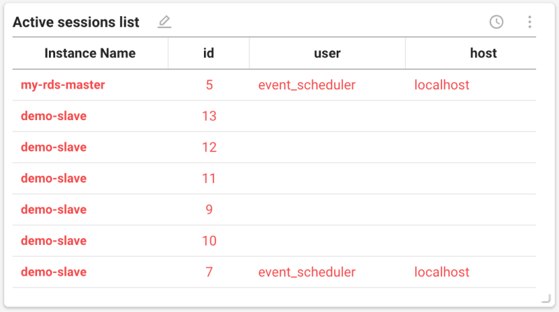
Click the more button () in the top right of the widget to use the following features.
-
 : set filter options to display only the data you want
 -
 : add or remove columns and change their order
Session table
This widget gathers the active sessions of databases scattered across multiple projects into a single widget. Sessions are shown in the same table even when the database products differ, so you can tell at once which instance has sessions piling up without opening each project one by one. The widget consists of the following four tabs.
| Item | Description |
|---|---|
| Active sessions | List of sessions currently running |
| Lock tree | Displays the relationship between lock-holding sessions and waiting sessions as a tree |
| Process info | List of processes on the database server |
| Parallel query tree | Displays the parent-child relationship of queries running in parallel as a tree |
Specifying the query scope
When the widget is placed on an Integrated Flex Board, you can select multiple projects. The selected projects are queried together even if their database products differ.
Click the settings button on the widget to specify the following items.
-
Group by project
Select this option to group rows by project. If it is not selected, all sessions are displayed as a single list.
-
Column selection
Specify the columns to display in the table. The seven columns common to multiple database products are displayed by default, and the other columns are provided in groups by database product. Items whose column names differ by product are normalized into a common column and displayed together in one column.
Checking details
-
Select an item in the instance column to open the Instance Monitoring screen of that instance in a new tab.
-
Select an item in the query column to open the SQL details window.
Query count limit
To reduce the load on the database and the screen, the widget behaves as follows.
-
Only the tab visible on the screen refreshes its data. Tabs that are not selected are not queried.
-
Up to
100rows are queried per group. When the limit is reached, the count is displayed in theN+form, and a tooltip appears on mouse over.
Checking the query time
The time selector at the top of the board sets the query range, and the session table widget shows one point in time within that range. The point you are currently viewing is displayed at the far right inside the widget.
All four tabs (Active sessions, Lock tree, Process info, Parallel query tree) use the same reference time. Previously the lock tree and the parallel query tree always queried the current time regardless of the board time; now all four tabs point to the same moment.
If you pause the board, all four tabs stop querying. If you move the tick while paused, the table is refilled with the data for that point in time.
Downloading as CSV
You can download the table as a CSV file on all four tabs. Click the download button at the top right of the widget.
-
The rows shown on screen are downloaded as they are. Filters and column selection are reflected, and if the board is paused, the data of the selected tick is included.
-
The
projectanddbTypecolumns are added at the beginning of the file. Multiple projects and database products are mixed in one table, so without these two columns you could not tell which database a session belongs to from the file alone. -
The lock tree and the parallel query tree cannot express a hierarchy in CSV, so child rows are expanded and written in order, with the hierarchy recorded in the
depthcolumn.
Using session filters
Use the filter button at the top right of the widget to specify the conditions for the sessions to display. This works the same way as the session table in instance monitoring.
| Tab | Filter |
|---|---|
| Active sessions · Lock tree | Share one set of conditions |
| Process info | Uses separate conditions |
| Parallel query tree | No filter provided |
Active sessions and the lock tree share conditions because they are tabs that show the same sessions in different shapes. If they were separate, you would have to set the conditions again every time you switched tabs.
The filter target attributes are the columns of all selected database products. Common columns that normalize items named differently per product are provided along with each product's original fields, and the attribute list is displayed grouped by product. If you set a condition on a product's original field, only that product's rows remain, because rows of other products do not have that value and are naturally excluded.
In the lock tree, conditions are applied per chain. The entire chain that contains a matching session is kept so that the relationship between the session holding the lock and the sessions waiting for it is not broken.
 Group widget
This widget groups multiple widgets into one composite.
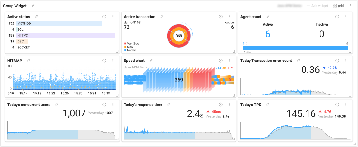
Place a group widget
-
In the Widget templates list, select ETC > Group Widget.
-
In the top right of the placed group widget, select the Project selection button and choose the project that will provide data.
-
In the top right of the group widget, select the grid button and set the layout you want.
-
Select the Apply button to complete layout settings.
-
In the top right of the group widget, select the Add widget button.
-
When the Widget templates list appears on the right, choose the widgets you want in order.
-
Only one project can be selected in a group widget.
-
Widgets are placed in the order added. To change order, click and drag the widget name to the desired position.
-
You can place up to 36 widgets in a group widget. You cannot add more widgets than the number set in the grid option.
-
When you have placed the maximum number of widgets, the grid button becomes disabled.
-
You can open a group widget in a new window. Enter View mode, then click the
 button in the top right of the widget.
Remove a widget in a group widget
To delete an individual widget placed in a group widget, click the more button () in the top right of the widget, then click the  button.
Collapse or expand a group widget
You can collapse or expand a group widget. Click the  or
or  button in the top right of the widget.
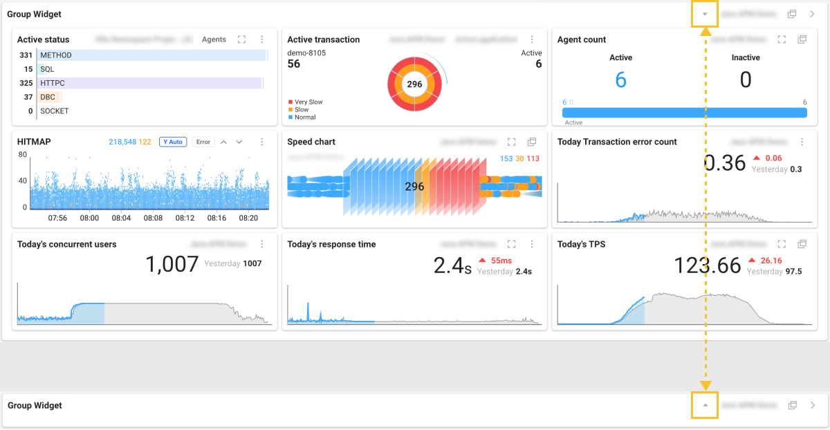
This feature helps you use space efficiently when many widgets are placed on a dashboard. You can also expand only when you want to view information.
Alert and status widgets
 Alert
Alert
Alert list
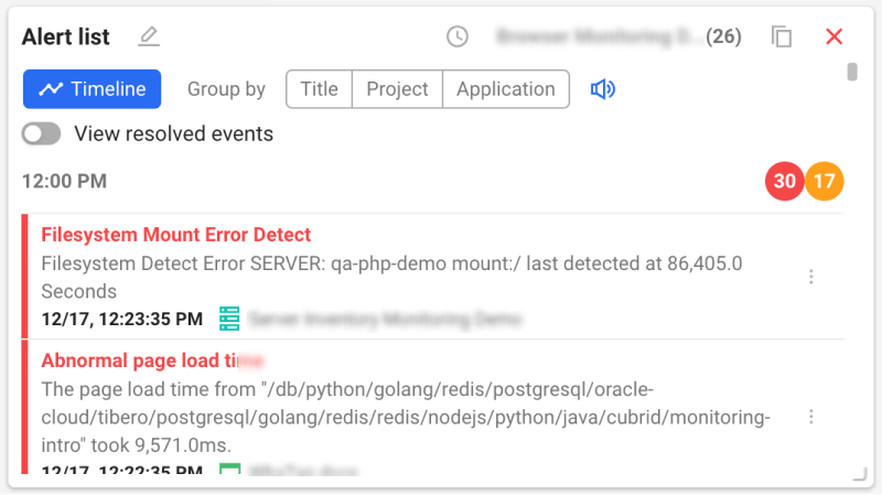
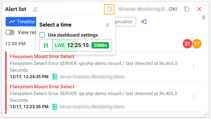
You can track alerts in real time or set a specific query time for one or multiple projects.
Edit Mode
-
In Edit Mode, you can group and sort by Title, Project, and Application. To disable grouping, select the Timeline button.
-
To include resolved events, enable the View resolved events option.
-
You can set a separate time from the dashboard’s query time. Select the
 button. When the Select a time popup appears, uncheck the Use dashboard settings option.
-
For details on the Select a time option, see the next document.
-
To toggle alert sounds on or off when alerts occur, select the
 button.
View mode
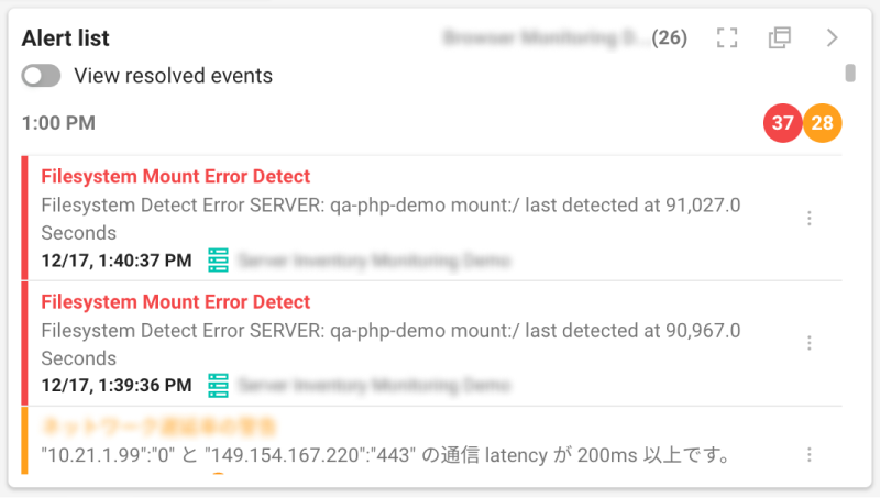
In View mode, you can check alert status based on the settings from Edit Mode.
-
To view the alert list in full screen, select the
 button.
 -
To open the alert list in a new window, select the
button.
Event Timeline
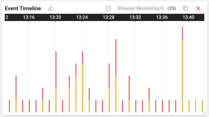
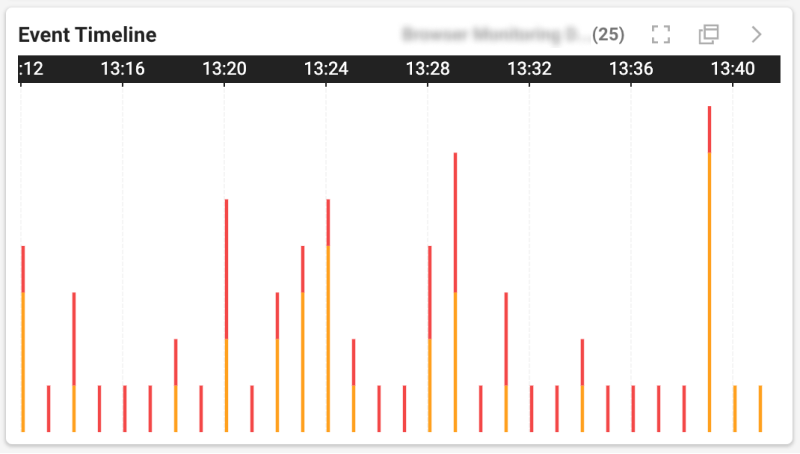
You can check alerts by time for one or multiple projects in chart form.
-
In Edit Mode, you can set a separate time from the dashboard’s query time. Select the
button. When the Select a time popup appears, uncheck the Use dashboard settings option. -
In View mode, to view full screen, select the
button. To open in a new window, select the button.
 Status check
This widget displays current status and results based on data collected from monitoring targets. You can monitor increase or decrease for a specific service.

Click the more button () in the top right of the widget to use the following features.
-
: add or remove the data you want and change order
-
 : show only text information without the graph chart
 -
 : show text information with the graph chart
Information widgets
Text
This widget displays metric values in text form.
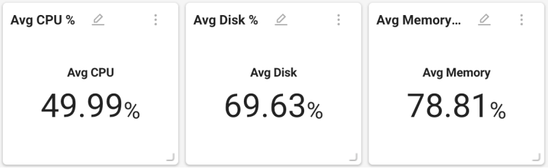
Click the more button () in the top right of the widget, then click the button to add or remove the data you want and change order.
 Overview
This widget presents project summaries or explanations of specific metrics.
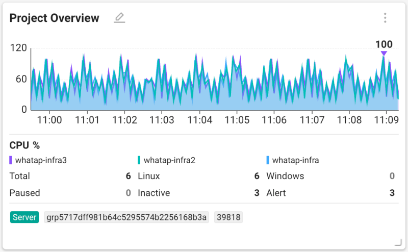
Displayed summaries differ by the selected project’s product type.
Page load Timeline
This is a Browser product only widget that shows Page load Timeline information.

For details on Page load Timeline, see the next document.
Other widgets
 Rich text
You can enter any text and place it as a widget.
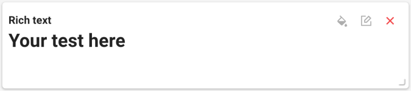
You can edit text and set formatting using options provided in the top right of the widget.
-
 : use the Edit widget option to set widget background and border and font color. After finishing, select the Save button.
 -
 : a Rich text window appears on the right. You can add or edit text and use the provided toolbar to set formatting.
 Maintenance plan
This widget shows maintenance plans for the selected project.
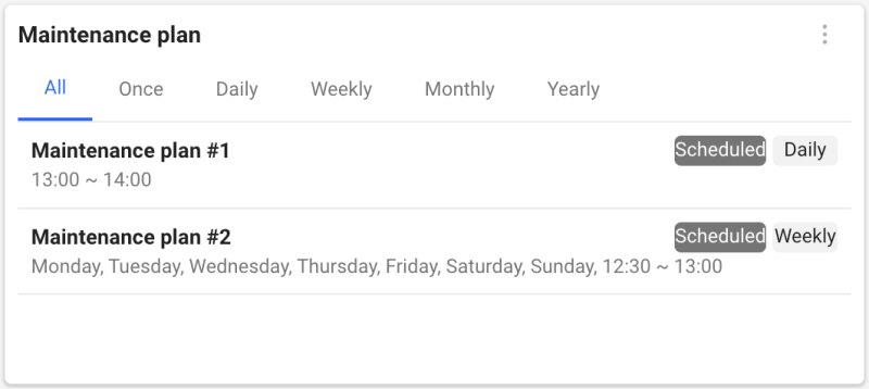
-
Only maintenance plans scheduled within 1 hour are displayed in the widget.
-
For details on the Maintenance Plan menu, see the next document.
 URL list
This is a URL product only widget that shows the list and status of registered URLs.
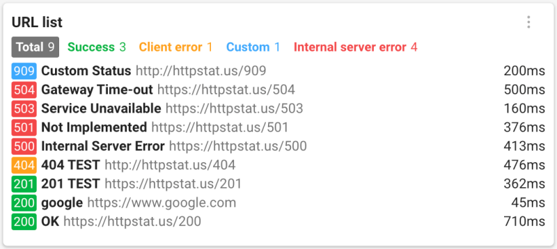
For details on URL monitoring, see the next document.
Metrics widget
You can add two widget types from All metrics: a table widget that lists tag and field information for a category, and a trend chart for a single field.
What metrics are
Numerical performance indicators collected in a project are called metrics. Metrics are classified by category, and you can explore data with category tags. For details on metrics, see the next document.
- Category: a unit that groups related indicators
- Tags: data that contains unique information to distinguish collection targets
- Fields: indicators collected from agents
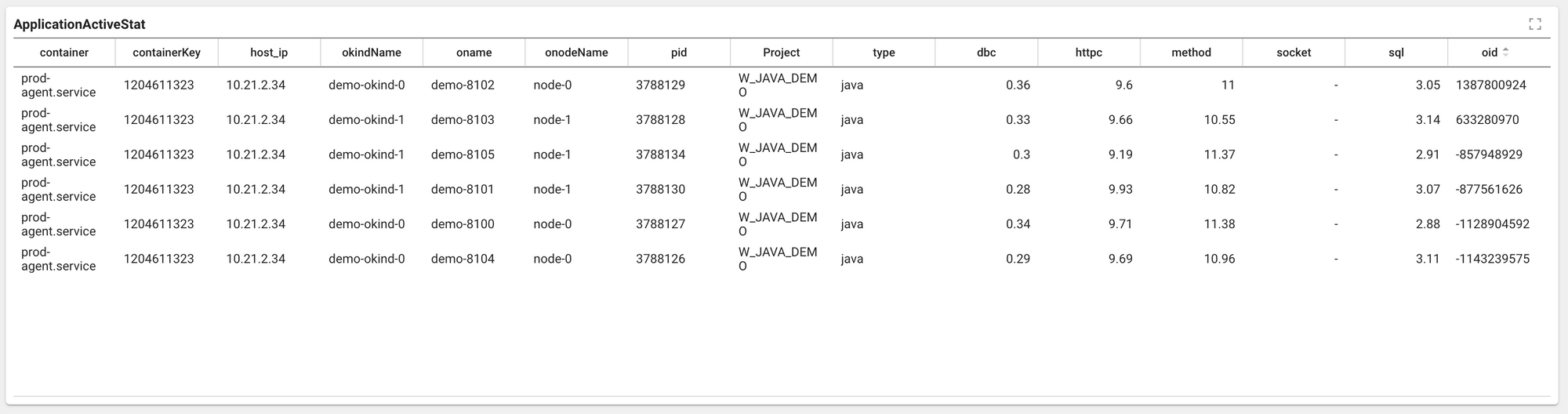
Table widget
Provides data for the selected metrics category in table form.
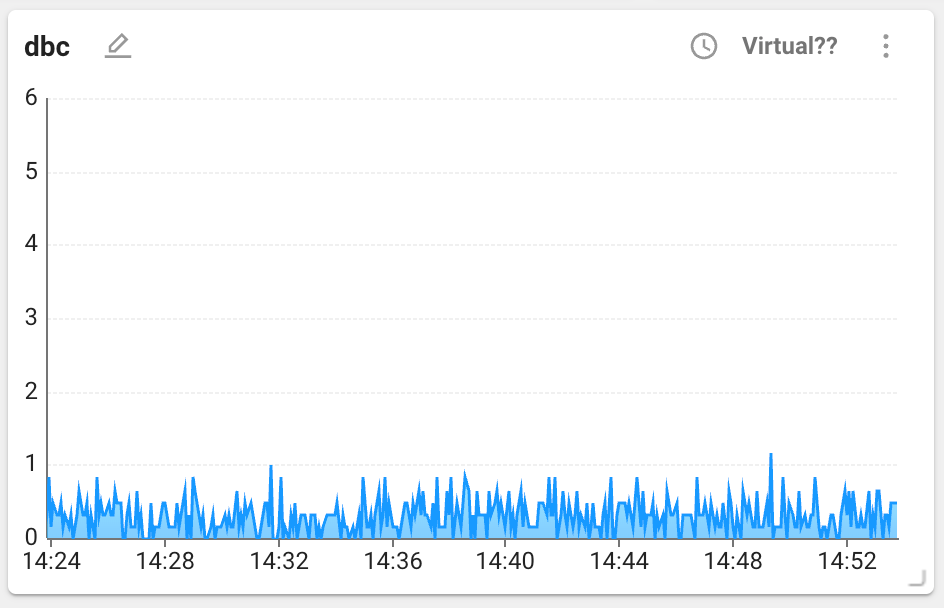
Series widget
Provides data for a selected field in the selected metrics category as a series chart.
For detailed settings of metrics widgets, refer to the product specific Flex board > Managing widgets document.