Widget Templates
It provides the types of widgets you can place on the dashboard from the Flex board. Widgets are components of a dashboard that allow you to visualize and connect the overall data for monitoring targets. Select a dashboard from Integrated Flex Board or Flex Board and then go to Edit Mode. In Widget templates, you can see a list of widgets that can be placed on the dashboard.
| Integrated Flex Board | Flex Board |
|---|---|
|
|
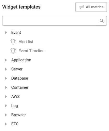
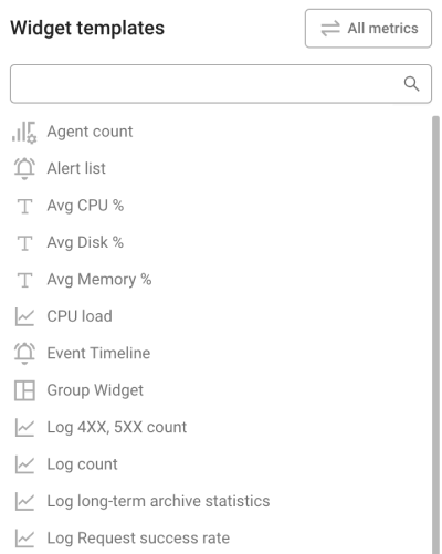
In Integrated Flex Board, users can select widgets for all products in the project they belong to. In Flex Board, users can select the widgets only for the product type of the project.
-
Depending on the product type of the project, the widgets that can be selected in Widget templates may differ.
-
For more information about the common options available on the upper right of the widget, see the following.
-
Depending on the assigned role, you may not use the widget's features. For more information about the member roles, see the following.
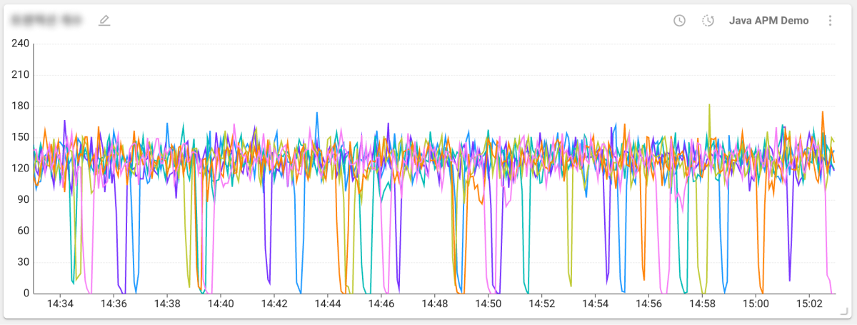
Graph
This data graph widget can be placed on the dashboard.
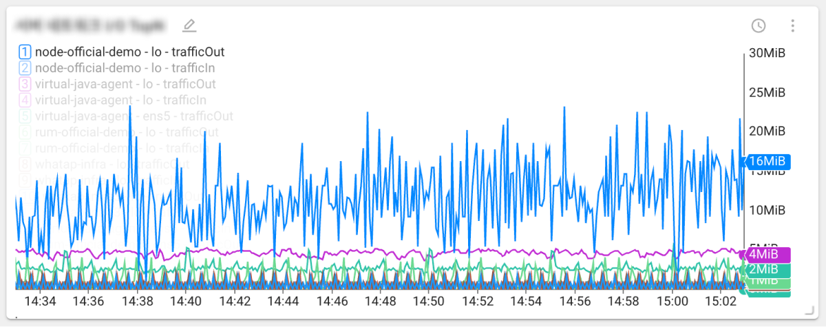
 Time series
You can use the time series chart widget to observe changes in metrics over time.
The time series chart widget provides the feature to compare with previous periods. Select ![]() on the upper right of the widget.
on the upper right of the widget.
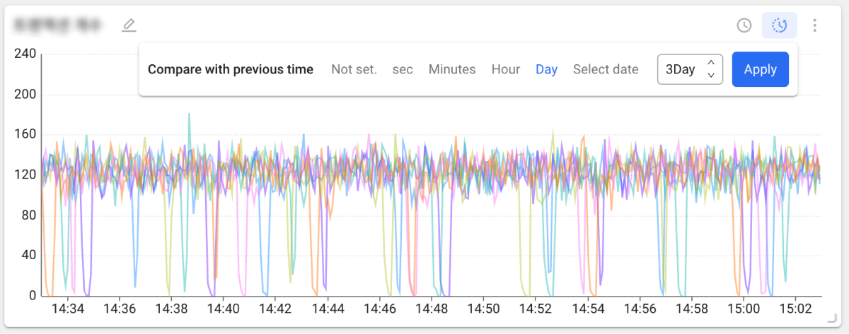
Select a desired time unit and then select Apply. By hovering the mouse pointer over the chart, you can view the data compared through a tooltip.
-
For more information about the data merge options, see the following.
-
According to the widget, the Compare with previous time feature may not be provided. This feature can be used in Edit Mode.
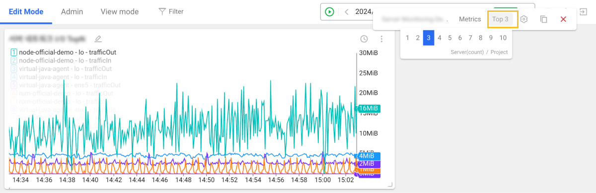
 TopN time series
Using this widget, you can check the ranking of metrics of the monitored targets along with metric changes over time.
You can set the top N number to display on the chart. In Edit Mode, select the More (![]() ) button on the upper right of the widget, and then click TopN.
) button on the upper right of the widget, and then click TopN.
 Apdex
Apdex
The Application Performance Index(Apdex) widget can check the application performance index.
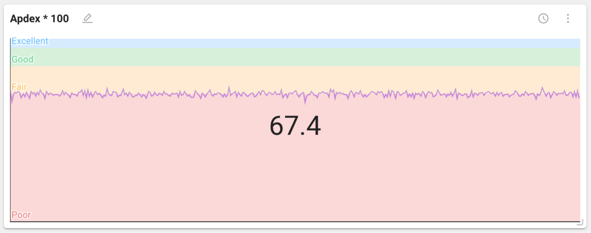
The Apdex widget can be used in the application monitoring suite of products. For more information, see the following.
 Pie
Pie
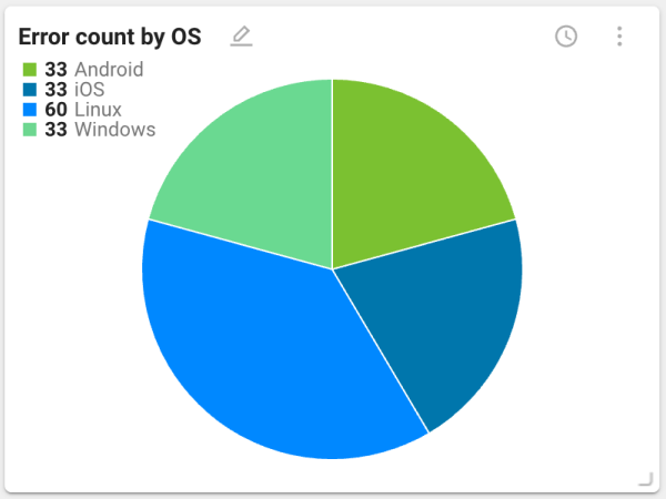
It is the pie chart widget. It is useful for checking the proportion of each segment compared to the overall collected data. It can be used to check figures such as CPU and memory usage, number of errors, and such.
 Hitmap
The Hitmap widget displays the response time of terminated transactions as a distribution chart.
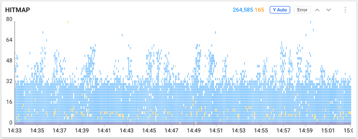
The Hitmap chart represents the distribution of response times of completed transactions. The horizontal axis is the transaction end time. The vertical axis is the execution time. Transactions with longer execution times are at the top of the distribution. If you drag the chart area in Hitmap, the Trace analysis window appears that you can see the transaction information details.
-
For more information about Hitmap widget, see the following.
-
For more information about Trace analysis, see the following.
 Bar
Bar
This bar chart widget is useful for comparing the data collected from monitoring targets.
The vertical bar chart is provided by default, but you can change it to horizontal one. In Edit Mode, select the More (![]() ) button on the upper right of the widget, and then click
) button on the upper right of the widget, and then click ![]() .
.
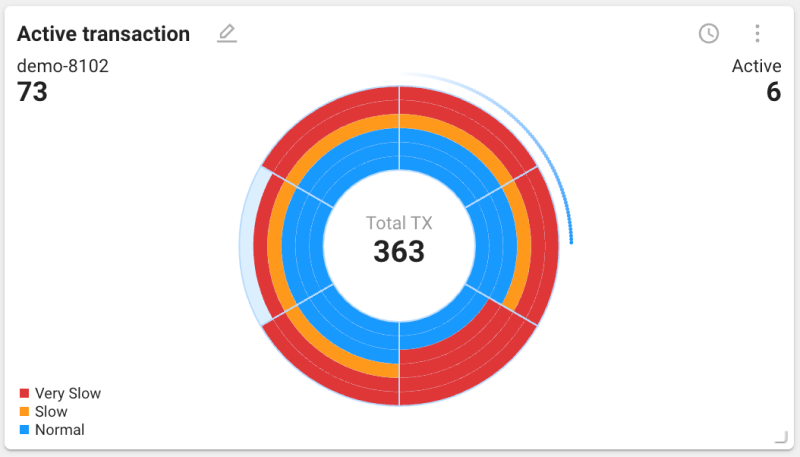
 Arc equalizer
This arc equalizer chart widget visualizes the transactions occurring from the monitored targets and allows comparison by agent.
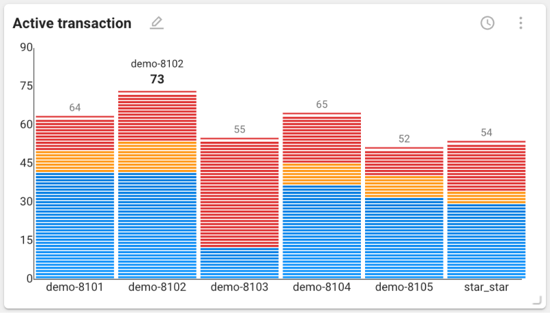
The arc equalizer chart is provided by default, but you can change it to a vertical one. In Edit Mode, select the More (![]() ) button on the upper right of the widget, and then click
) button on the upper right of the widget, and then click ![]() .
.
This Active Transaction arc equalizer chart can be used in the application monitoring suite of products. For more information, see the following.
 Tree map
This widget allows you to visually check the disk or memory usage of the server. The size and color of each block indicate its usage and status.
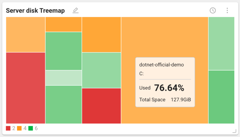
When you hover your mouse pointer over a block on the default chart, a tooltip appears displaying the value of the block. To change the chart to display the numbers for individual blocks, select the More (![]() ) button on the upper right of the widget, and then click
) button on the upper right of the widget, and then click ![]() .
.
 Scatter plot
A scatter plot is used to visually display the relationship between two variables, with each point representing a data point. It is also useful for identifying patterns or trends in large datasets, providing a visual distribution of data points. Through this, you can identify performance issues occurring at specific time periods.
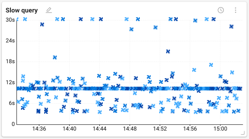
-
x-axis: It represents time and indicates the moment when the data point has been recorded.
-
y-axis: It represents the processed time and indicates the duration taken by the data point.
-
By dragging over a part of the chart, you can see the detailed information.
 Geographic map
It is a type of map chart widget that allows you to visually see the spatial data. This widget helps you identify and analyze regional performance differences by visualizing data values combined with geographic locations.
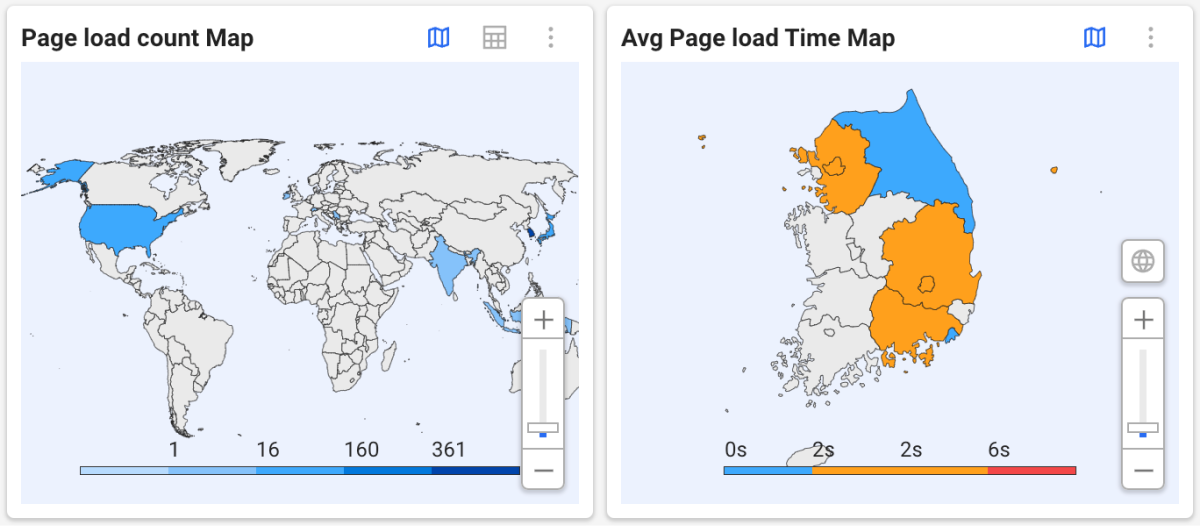
-
You can scroll the mouse wheel or use the slider to zoom in or out on the map.
-
To view the world map, select
 . You can select a country to see its regional data.
 -
To see the data in a table format, select
 . To return to the map format, select .
 -
In case of regional maps, data appears based on the upper administrative district. (Korea: province or metropolitan city)
This site or product includes IP2Location LITE data available from https://lite.ip2location.com.
 Speed chart
This *speed chart** widget visualizes the speed of active transactions occurring in the monitored objects. This widget provides a visual representation of the performance status of the monitored objects and is useful for analyzing performance metrics such as request processing time or response time.
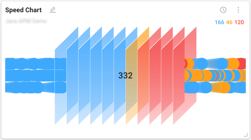
The speed chart widget can be used in the application monitoring suite of products. For more information, see the following.
 Honey comb type
The honeycomb chart widget allows you to check the performance and stability for the monitoring targets. Each color represents the performance and stability of the monitored objects. Blue means normal, orange means warning, red means slow, and gray means disabled.
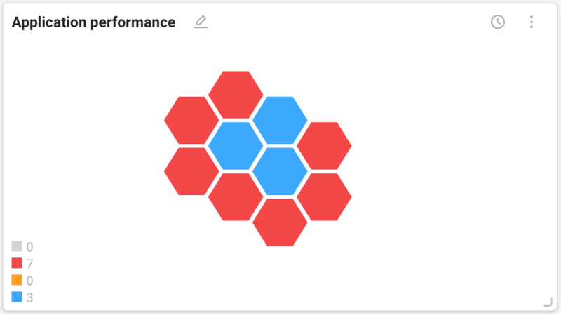
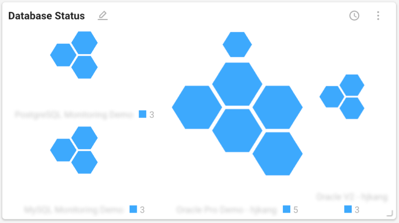
Depending on the monitoring product group, the types of collected data and the meanings of colors may differ.
List type
Table
This widget displays a list in table format. It is useful to understand the numerical values and status of the data collected from different monitored targets. For each item displayed in the list, you can see additional information through the columns. The color of the text in the list indicates its performance status.
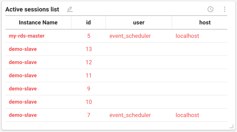
If you select ![]() on the upper right of the widget, you can additionally use the following features.
on the upper right of the widget, you can additionally use the following features.
-
 : You can set filter options to display only the desired data.
 -
 : You can add or exclude desired columns and change their order.
 Group widget
This widget allows you to display multiple widgets as a single group.
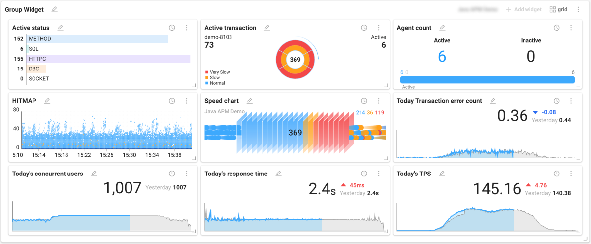
Placing group widgets
-
In the Widget templates list, select ETC > Group Widget.
-
Select a project from which you want to call data by selecting Project selection on the upper right of the placed group widget.
-
Set a layout by selecting grid on the upper right of the group widget.
-
Finish the layout configuration by selecting Apply.
-
Select Add widget on the upper right of the group widget.
-
When the Widget templates list appears on the right of the screen, select desired widgets one by one.
-
In the group widget, only one project can be selected.
-
Widgets are placed in the order they have been added. To change the order of widgets, click and hold a widget name and drag it to the desired position.
-
The maximum number of widgets that can be placed in the group widget is 36. You cannot add widgets more than the number set in the grid option.
-
Once you have placed all the widgets you can add, the grid button is disabled.
-
Group widgets can be viewed by opening a new window. Go to View mode and then select
 on the upper right of the widget.
Removing widgets in the group widget
To remove an individual widget placed in a group widget, select the More (![]() ) button on the upper right of the widget, and then select
) button on the upper right of the widget, and then select ![]() .
.
Collapsing/expanding the group widget
The group widget can be collapsed or expanded. Select the ![]() or
or ![]() button on the upper right of the widget.
button on the upper right of the widget.
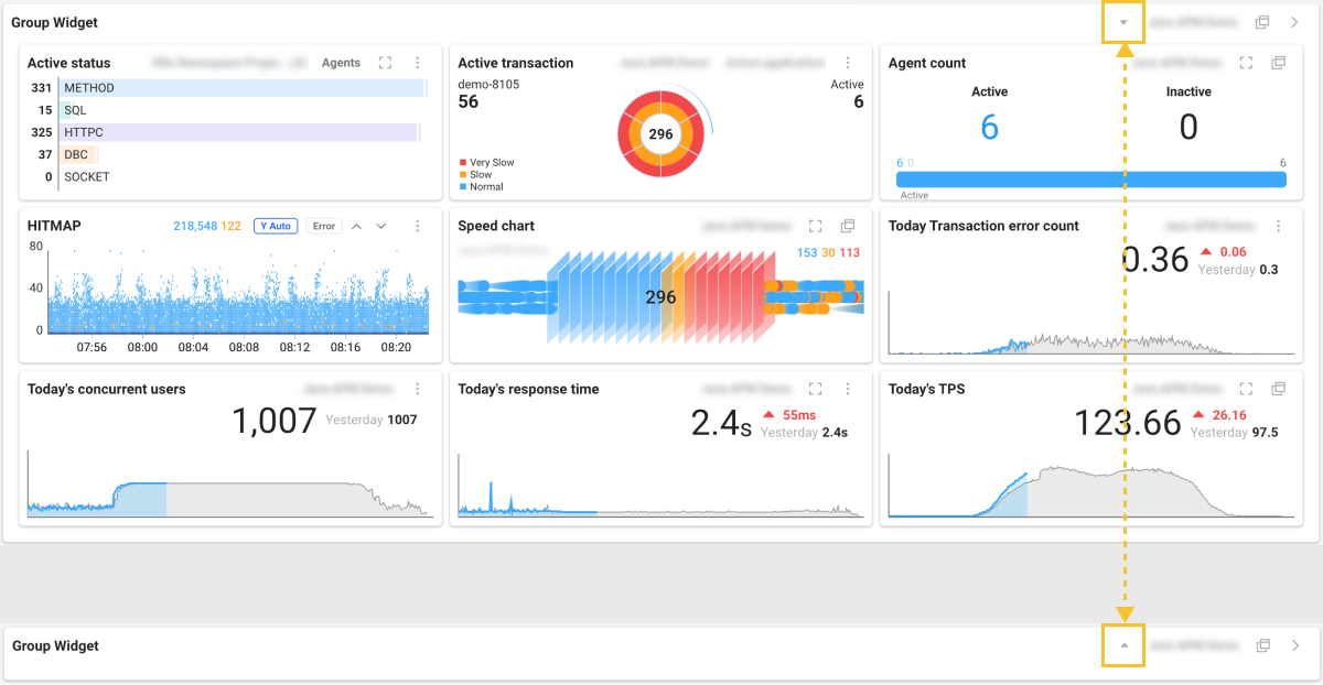
If you have a lot of widgets placed on the dashboard, this feature can help you use the screen efficiently. Additionally, you can expand and view only the information you need.
Checking notifications and status
 Alert
Alert
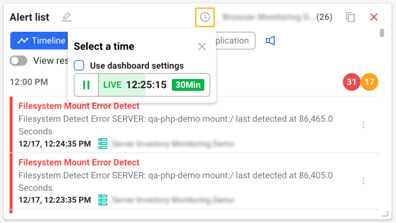
Alert list
You can check the notification history that occurred in one or more projects in real time or set a specific inquiry time.
Edit Mode
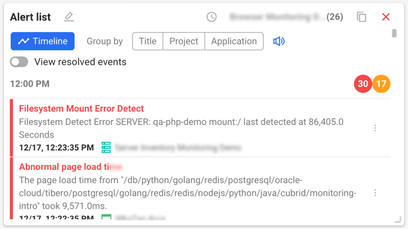
-
In Edit Mode, sorting is possible by grouping by Title, Project, or Application. To perform ungrouping, select Timeline.
-
Enable the View resolved events option to check including the list of resolved events.
-
You can set a separate time other than the query time set on the dashboard. Select
 . When the Select a time pop-up appears, uncheck the Use dashboard settings option.
-
For more information on how to use the Select a time option, see the following.
-
To turn the sound on or off when a notification occurs, select
 .
.
View mode
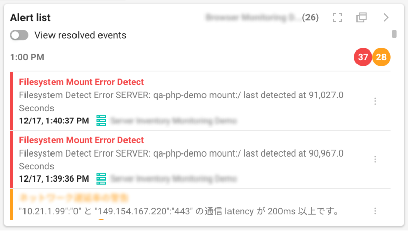
In View mode, you can check the notification occurrence status based on the setting of Edit Mode.
-
To view the notification list in full screen, select
 .
. -
To open the notification list in a new window for checking, select
.
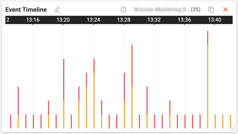
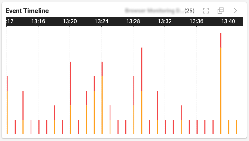
Event Timeline
You can view the time-based notification history for one or more projects in chart format.
-
In Edit Mode, you can set a separate time other than the query time set in the dashboard. Select
. When the Select a time pop-up appears, uncheck the Use dashboard settings option. -
To display a full screen in View mode, select
. To check in a new window, select .
 Checking status
This widget displays the current status and results through the data collected from the monitored targets. You can monitor the increase or decrease of specific services.
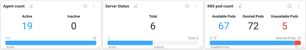
If you select ![]() on the upper right of the widget, you can additionally use the following features.
on the upper right of the widget, you can additionally use the following features.
-
: You can add or exclude desired data and change their order.
-
 : Only text can be displayed, excluding any graph chart.
 -
 : You can display the text and graph chart together.
Information
Text
This widget displays numerical values for a metric in text format.
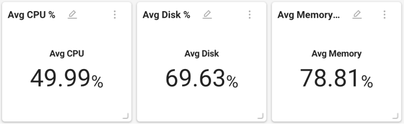
You can add or exclude desired data and change the order by selecting the More (![]() ) button on the upper right of the widget and then clicking the
) button on the upper right of the widget and then clicking the ![]() button.
button.
 Summary information
This widget provides summary information or description for a specific metric in the project.
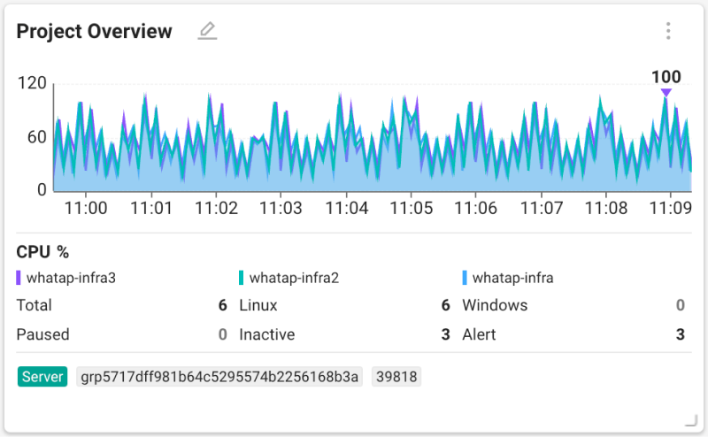
The displayed summary may differ depending on the product type of the selected project.
 Page load Timeline
Browser This product-specific widget displays the Page load Timeline information.
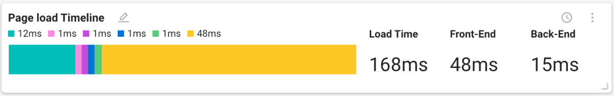
For more information about Page load Timeline, see the following.
ETC
 Rich text
You can enter the desired text and place it as a widget.
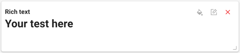
You can modify the text or set the template through the options provided on the upper right of the widget.
-
 : You can set the background, outline, and font colors by using the Edit widget option. After all settings are finished, select Save.
 -
 : In the Rich text pop-up window on the right of the screen, you can add or modify the text. You can also set the template by using the provided toolbar.
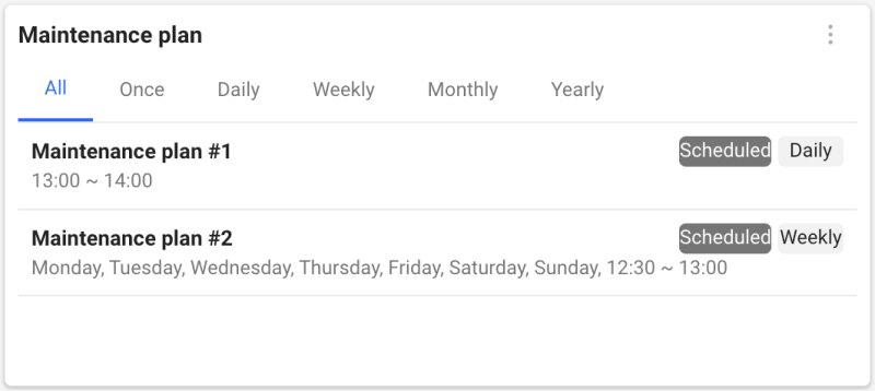
 Maintenance plan
This widget allows you to check the maintenance plan details of the selected project.
-
Only the maintenance plans scheduled within 1 hour are displayed on the widget.
-
For more information about Maintenance Plan, see the following.
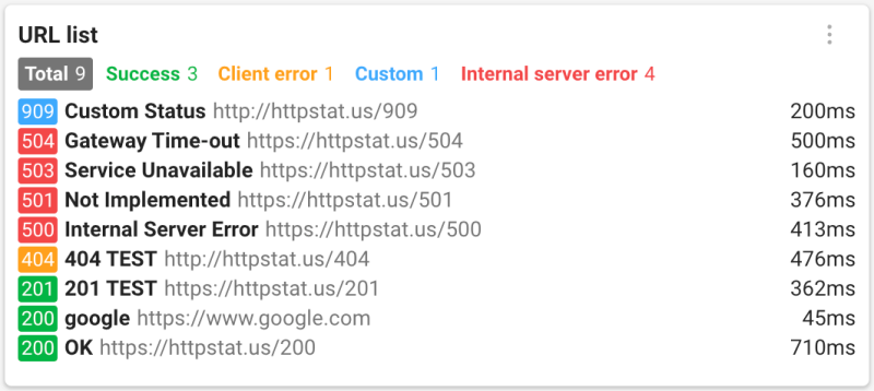
 URL list
URL This product-specific widget allows you to check the list and status of registered URLs.
For more information about the URL monitoring, see the following.