Metrics Chart
Home > Select Project > Analysis > Metrics Chart New
The Metrics Chart New menu is a core feature of the WhaTap monitoring solution, which provides the data collected from various monitoring targets in a visualized time-series chart. This allows users to effectively monitor the system performance, quickly identify anomalies, and gain insights for resolving issues.
-
You can visually check various metrics via time series charts, and analyze multiple metrics upon failure at a time.
-
You can select a specific time range to view past data and analyze the performance at that period.
-
You can filter data based on specific time zones or conditions for more accurate analysis.
-
Users can place their desired charts on the screen and freely adjust the layout.
-
Users can arrange desired metrics and save them as presets for loading at any time.
Difference from the Metrics Chart menu
The following are the changes since the Service 2.8.0 update. To check the changes on the screen after the update, select Tutorials on the upper right.
-
User experience (UX) has been improved so that users can set the time, target, and interval options, and then specify the metrics to monitor and add charts.
-
You can change the time range of a chart view without deleting the widgets placed on the dashboard.
-
It provides a batch Batch Change feature that allows you to apply options to all widgets placed on the dashboard at once.
-
The preset feature allows you to save and load the widgets placed on the dashboard.
-
You can adjust the layout of the dashboard and the functionality of the widgets through various options provided.
Adding a chart widget
To add a metric as a widget to the dashboard, select Add chart on the upper left.
Setting the lookup time
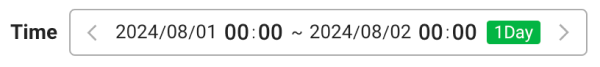
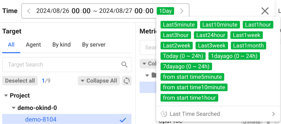
In Time, set the date and time to view the metric.
-
Select the green button on the utmost right, you can select from various time ranges.
-
By selecting
 or
or  , you can shift the time. The shifting interval is the time interval set on the right.
 -
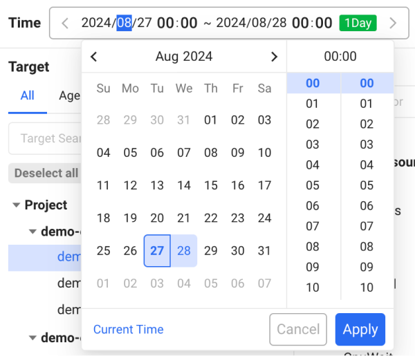
Click the Date & Time area to manually select the desired date and time.
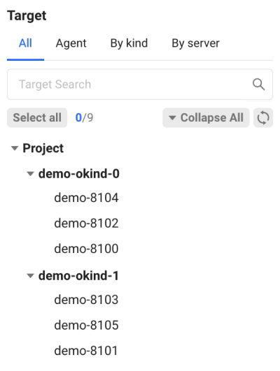
Selecting a target
Select a desired target from the agents in the project. You can select an individual agent or a group classified by the agent configuration.
-
Agent: You can select an individual agent or all agents.
-
By kind: Agents can be monitored in each group classified by
whatap.okindin the agent configuration. -
By server: Agents can be monitored in each group classified by
whatap.onodein the agent configuration.
-
Depending on the set time and date, available targets may change.
-
You can select or deselect targets by clicking in the agent list. You can also select multiple agents at once by using the
Shiftkey. -
By clicking Select all or Deselect all, you can select or deselect related sub-targets at once.
-
If a desired agent does not appear in the list, select Refresh.
-
By selecting Collapse All or Expand All, you can hide or expand the list by group.
Selecting a metric
Select a target agent to monitor. Then the list that can be selected on the Metric panel appears. Select a desired metric in the list.
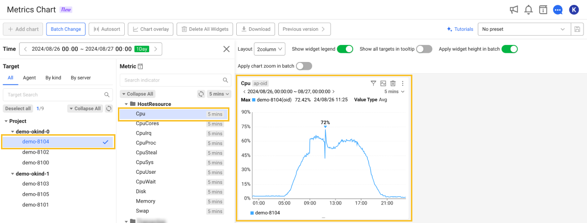
A chart widget for the selected metric is placed on the dashboard on the right. You can add chart widgets by selecting additional metrics. To enlarge the chart area, select ![]() on the right of the Time option. The Target and Metric panels disappear, leaving only the chart area visible on the screen.
on the right of the Time option. The Target and Metric panels disappear, leaving only the chart area visible on the screen.
- If you enter a string in the Search indicator field, you can quickly search for a desired metric.
- You can also search by metric category and field name. For more information about the categories and fields, see the following.
-
By selecting Collapse All or Expand All, you can hide or expand the metrics list by category.
-
If a desired metric does not appear in the list, select Refresh.
Setting the interval
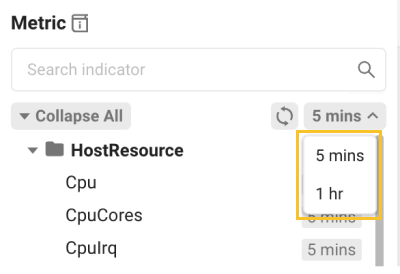
You can set intervals for each chart, allowing you to adjust the aggregation unit of data to visualize at different time intervals. If you select ![]() on the upper right of the Metric panel, you can select an interval option.
on the upper right of the Metric panel, you can select an interval option.
Each metric has a different default interval time, and the interval time changes depending on the query time range.
For example, the 5 min interval displays average values for 5-minute intervals, and the 1 hour interval displays average values for every one hour.
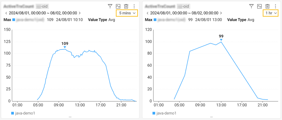
By adjusting the interval option, you can analyze the data from different perspectives, from detailed data over a short time to overall trend over a long time.
Changing the query time
To change the chart query time range for an individual widget, select ![]() or
or ![]() at the top of the widget. The time change range is the same as the time reference set in the Time option. For example, if the Time option is set to 1 day and you select
at the top of the widget. The time change range is the same as the time reference set in the Time option. For example, if the Time option is set to 1 day and you select ![]() or
or ![]() , you can change the time to a daily interval.
, you can change the time to a daily interval.
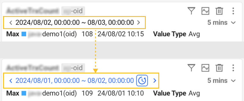
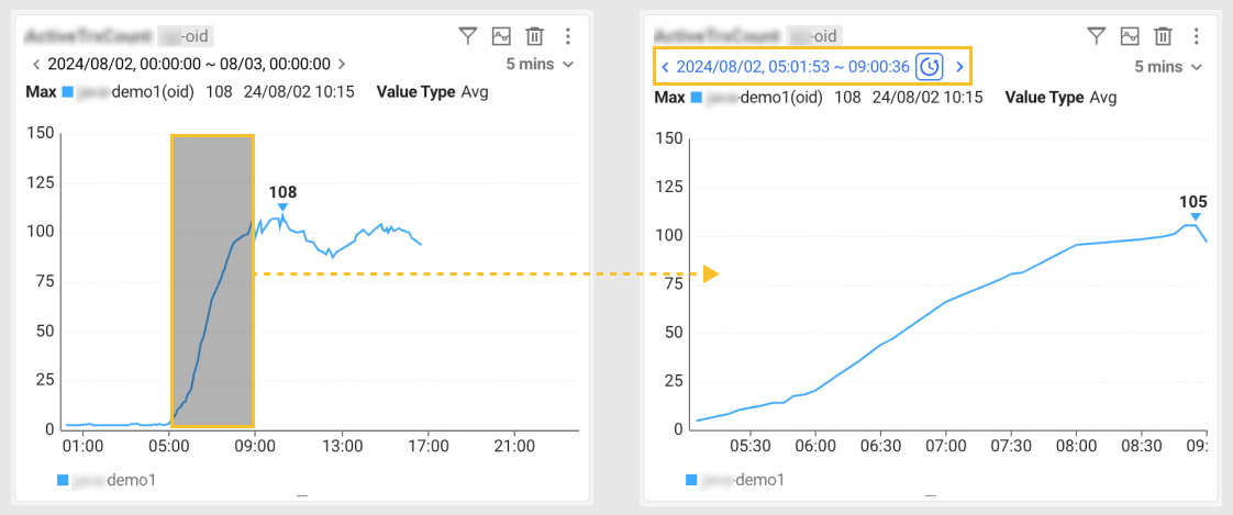
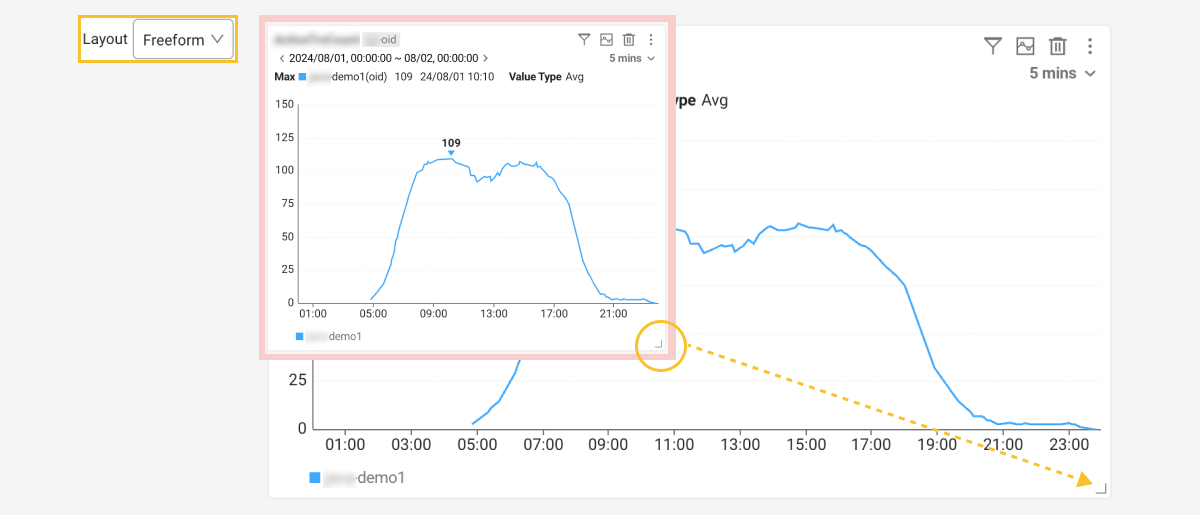
Alternatively, by dragging a specific area of the chart, you can change the time according to the dragged range for a view.
-
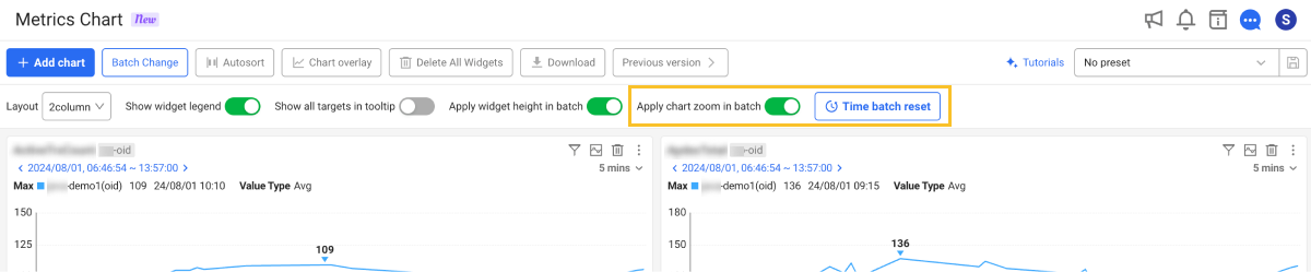
You can change the time for all widgets by changing for each widget with the Apply chart zoom in batch option enabled at the top of the screen.
-
To change the query time range and then change it back to a recent time, select
 .
.If the Apply chart zoom in batch option is enabled at the top of the screen, the
 Time batch reset button appears. By selecting this button, you can reset the time for all widgets.
By using the Batch Change feature, you can change the time for all widgets and change the monitoring target and interval. For more information, see the following.
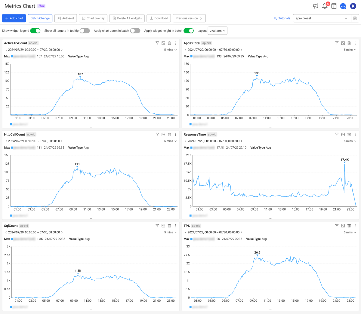
Chart details
See details for each item displayed in the chart widget.
-
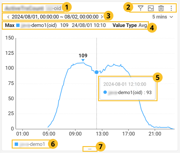
 Metric name and category: It displays the metric name of the chart widget. On the right of the metric, the categories of the query targets are displayed in tag format. The category name may differ depending on the product.
-
*oid: It is displayed when an individual agent is selected. -
project: It is displayed when the target is selected on a project basis. -
okind: It is displayed when a group classified aswhatap.okindis selected in the agent configuration. -
onode: It is displayed when a group classified aswhatap.onodeis selected in the agent configuration.
-
-
 Widget option: Option menu of the chart widget. For more information, see the following. For more information about the interval options, see the following.
 -
 Time: It displays the time range for which data in the chart is viewed. By selecting or , you can adjust the time range for a query.
 -
 Data: You can check the maximum value (Max) of the data viewed from the monitoring targets and the data merge method (Value Type).
 -
 Chart: It displays the viewed data in a time series graph. If you hover your mouse pointer over the graph, you can see detailed information through a tooltip. By dragging a specific area of the chart, you can change the time according to the dragged range for a view.
 -
 Legend: It displays the monitoring targets as a legend.
 -
 Resize: You can adjust the size by dragging the center of the bottom of the chart widget.
Using the chart widget options
Various features can be used through the option buttons on the upper right of the chart widget.
 Filtering targets
You can add or remove monitoring targets to/from the chart widget added to the screen.
-
If you select
, a pop-up menu appears for you to select monitoring targets.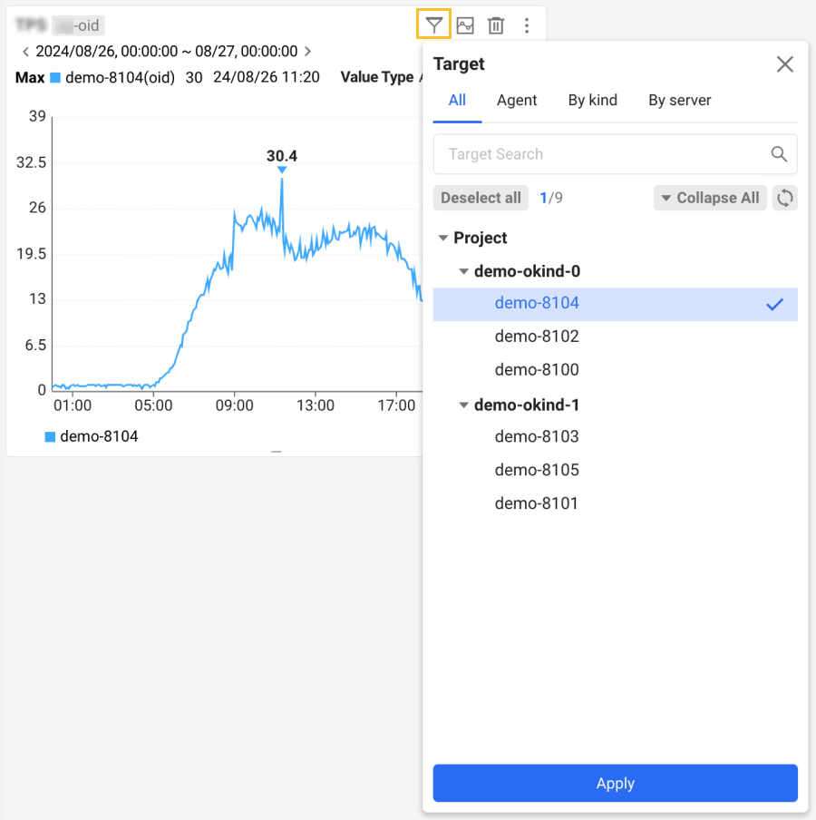
-
Select the desired targets according to the instructions on the screen.
-
Select Apply.
 Viewing the details
To check the detailed information about the chart data in a wider screen, select ![]() . The View details window appears. You can view charts, averages, and maximum values for individual targets.
. The View details window appears. You can view charts, averages, and maximum values for individual targets.
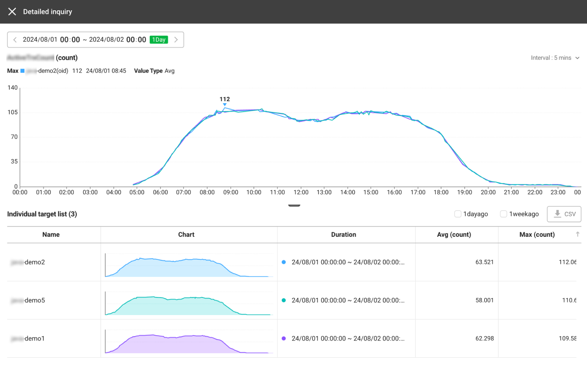
-
1dayago: You can compare the data with that from the previous day.
-
1weekago: You can compare the data with that of the previous week.
-
 CSV: The viewed data can be downloaded as a CSV file.
 -
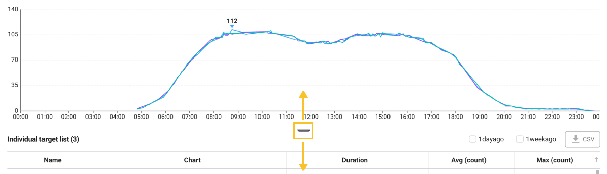
You can resize the chart by dragging the icon at the bottom of the graph.
 Removing the chart widget
To remove any chart widgets placed on the screen, select ![]() .
.
Using additional options
If you select ![]() on the upper right of the chart widget, you can select the following additional options.
on the upper right of the chart widget, you can select the following additional options.
-
Download CSV: You can download the data searched from the chart as a CSV file.
-
Download Image: You can download the chart as an image file.
-
Setting
-
Use Y axis automatically: The size of the Y-axis can be automatically adjusted within the searched range.
-
Show maximum value: You can display the maximum value in the graph area of the chart.
-
Setting presets
You can save and load the settings and layouts for widgets on the dashboard. You can create a new preset by adjusting its size and placing it on the desired position.
You can save or modify the presets with the Edit project role. For more information about the member roles, see the following.
Creating a new preset
-
Place the widgets in the desired format on the dashboard. You can also resize and place only the widgets to be frequently checked.
-
On the upper right of the screen, select
 .
. -
Enter a new preset name.
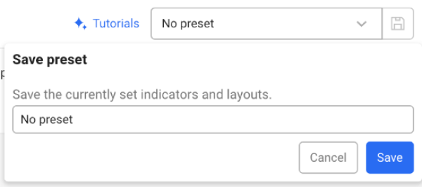
-
Select Save.
You can see the newly saved preset from the preset list.
-
If any changes are made to the newly created preset, save the preset again. Select
and then save the preset with the same name. Any changes are overwritten in the existing preset. -
If you go to another menu without saving changes on the dashboard, the changes are not saved.
-
Presets are saved on a project basis and can be shared with other users.
-
The targets saved in the preset are the layout of the dashboard, the widgets placed on the dashboard, and the options (Target, Interval) modified in the widgets. The Time option at the top of the screen is not saved.
-
To change the widget query time after loading a preset, use the Batch Change feature. For more information, see the following.
Deleting presets
If you have unused presets, you can delete them from the preset list. Select ![]() on the right of the item to delete from the preset list.
on the right of the item to delete from the preset list.
Editing a dashboard widget
The widgets placed on the dashboard can be placed and resized to the user's desired location.
Moving a widget

When you move the top part of the widget by using the mouse pointer, it changes to the  shape. At this time, you can move the widget by dragging with your mouse to the desired position.
Resizing a widget
If Layout among the dashboard options is set to Custom, you can resize the widget.
Click and hold the mouse on the  element at the lower right of the widget, and then drag it to the desired size.
If Layout is not set to Custom, you can adjust only the height of the widget. Resize the widget with the bottom center of the widget clicked with your mouse.
Using the dashboard options
You can apply various settings to the chart widget at once using the Option menu located at the top of the screen. You can also customize the dashboard layout to your desired format.

Batch update of the chart widget options
It provides the feature to apply detailed options to the chart widgets on the screen at once. On the upper left of the screen, select Batch Change. If the Batch Change window appears, set the desired options and then select Apply.
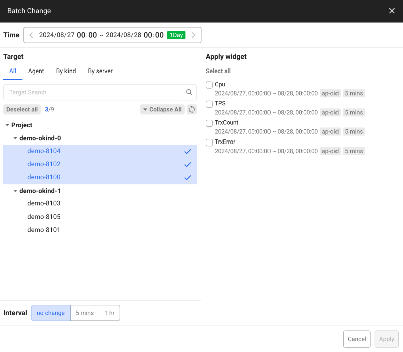
-
Time: You can set the data query range for the chart.
-
Target: Select a monitoring target. You can select an individual agent or a group classified by the agent configuration.
-
Agent: You can select an individual agent or all agents.
-
By kind: Agents can be monitored in each group classified by
whatap.okindin the agent configuration. -
By server: Agents can be monitored in each group classified by
whatap.onodein the agent configuration.
-
-
Interval: You can adjust the data aggregation unit to various time intervals.
-
Apply widget: Select a chart widget to apply the options to change. You can apply changed options to the selected widget at once.
Auto-aligning the dashboard
To auto-align the widgets placed on the dashboard, select Autosort. It auto-aligns widgets in order of their width and height, from smallest to largest. If the widths are the same, it aligns them in order of height, from smallest to largest.
Comparing multiple charts
This feature allows you to view data from multiple charts placed on the dashboard in a single chart. This feature allows you to compare multiple metrics from the same time period with others. Select Chart overlay. You can place overlay charts on the screen.
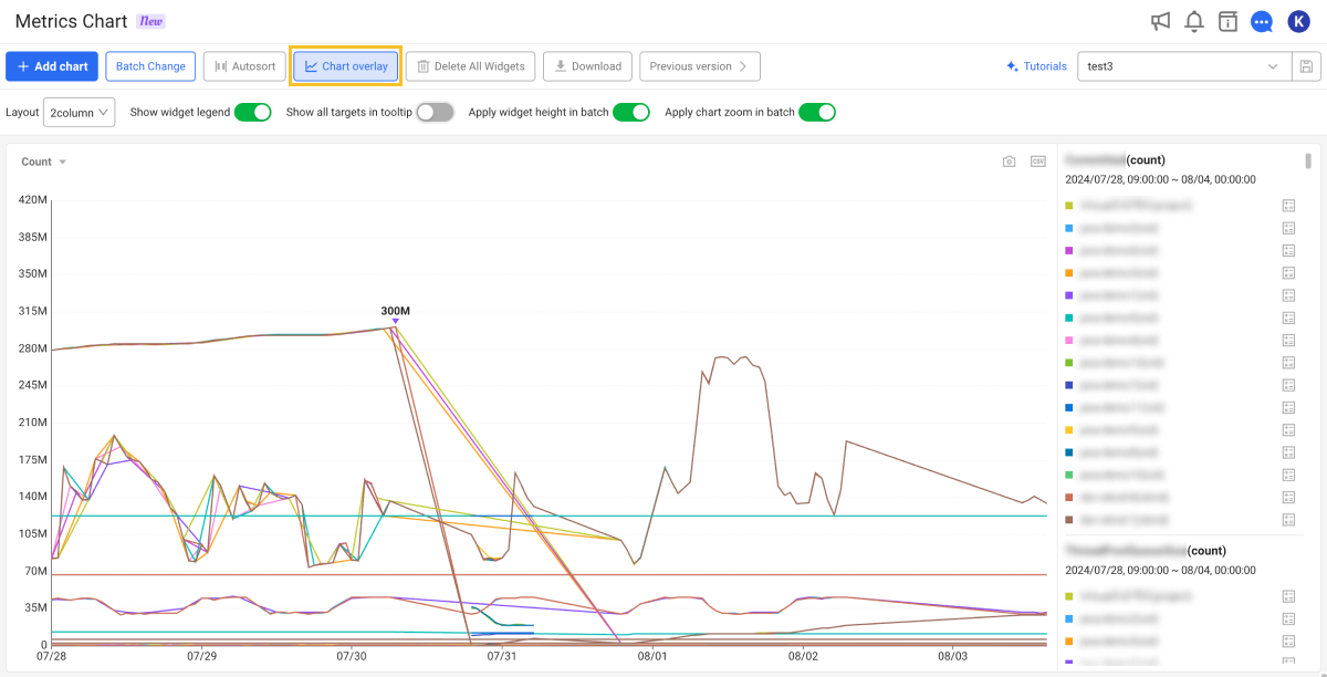
-
If you select Count on the upper left of the overlay chart, a list appears where you can change the data criteria for the x-axis chart. You can compare the data of the chart by selecting a desired item.
-
 : You can download the chart as an image file based on the current view.
 -
 : You can download the chart as a CSV file based on the current view.
 -
In the right section, you can see a list of agents for each metric. The colors of individual agents match the graph colors on the chart.
Batch deletion of placed widgets
You can delete multiple widgets placed on the dashboard all at once. Select Delete All Widgets. When the confirmation message appears, select Delete.
Downloading as a CSV file
You can download data from the widgets placed on the dashboard as a CSV file. Select Download > Download CSV. You can check the data of metrics for each time zone.
Downloading as an image file
You can download all the widgets placed on the dashboard as a single image file. Select Download > Download Image. You can save a captured image of the dashboard screen as is.
Using the previous version
To use the Metrics Chart menu of the previous version, select Previous version. Alternatively, you can see in the ![]() Sitemap > Analysis > Metrics Chart
Sitemap > Analysis > Metrics Chart Old path.
For more information about Metrics Chart Old, see the following.
Using other options
Other options below allow you to adjust the layout of the dashboard or easily and conveniently batch set the applied options to the widgets.

-
Layout: You can set the number of columns in the dashboard (or the number of widgets that can be placed in a row). You can set up to 4 columns. If Custom is selected, widgets can be placed regardless of the number of columns.
NoteIn Custom, you can freely adjust the width and height of the widget. If you select another option, you can only adjust the height of the widget.
-
Show widget legend: Turning the option on or off can show or hide the legend at the bottom of the widget's chart.
-
Show all targets in tooltip: When you hover your mouse pointer over the chart, you can see the value for the point on the graph through a tooltip. Turn on the option to view data for all targets in the time zone where the mouse pointer is located through the tooltip.
-
Apply widget height in batch: Enabling this option forces all widgets to have the same height.
-
Apply chart zoom in batch: When changing the data query time of an individual chart widget, turn on this option to also change the chart times for other widgets.
Using the tutorial
When you select Tutorials on the upper right of the screen, you can check the changes after the Service 2.8.0 update.