Setting a widget
Widgets placed in the dashboard menu can be set with the desired options.
Depending on the screen size of the web browser, the icon shape on the upper right of a widget may differ. If you select , the additional icons appear.
Changing data based on the graph chart

On the upper right of the widget, select the Metrics button. The metrics pop-up window appears. You can change the data of the graph chart by selecting the desired item.
- The items that can be selected in the Metrics pop-up window may differ depending on the widget.
- Depending on the widget's data, the Metrics button may not be available.
Viewing the full screen
Select on the upper right of the widget to view on the full screen. You can check the widget's graph chart in full screen on the web browser.
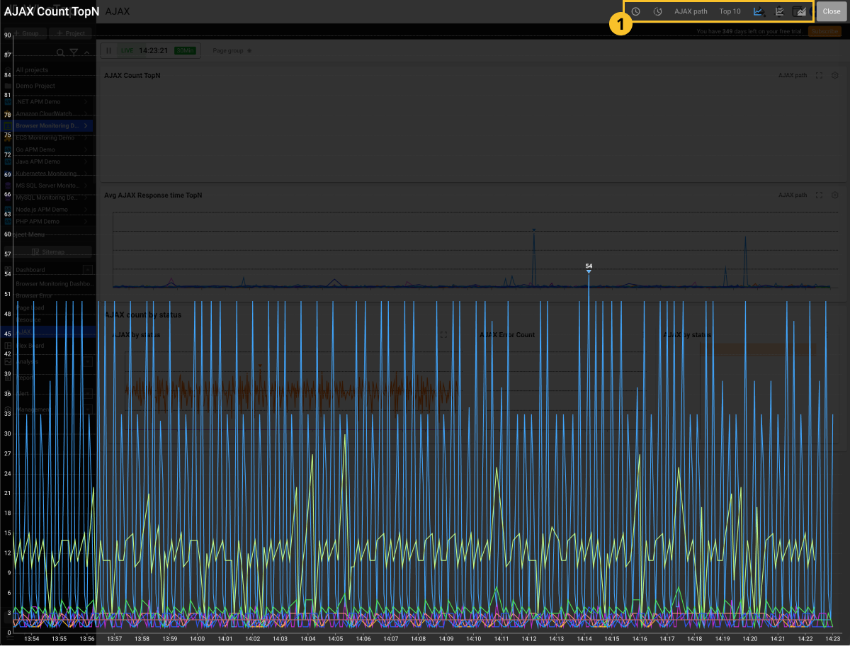
By selecting the option buttons on the upper right of the screen, you can view the data with various ways.
Depending on the widget's data type, available options may differ.
Changing the data lookup time
You can see the current data flow in real time and also check the data of the past. Select . The Time Selector pop-up window appears.
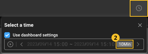
- To change the data lookup time on the graph chart, deselect Use dashboard settings.
- To perform monitoring for graph charts in real time, select
.
- The query time can be changed by selecting
.
- By selecting
or
, you can shift the time. The shifting interval is the
time interval set on the right.
- By clicking the
time interval button, you can select a time interval.
- Click the Date & Time area to manually select the desired date and time.
Comparing with the previous time
You can compare the past data with the current data. Select . The Compare with previous time pop-up window appears.
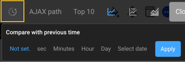
You can compare the time in seconds, minutes, hours, and dates, or select a date for comparison. Select the desired options and then click Apply to apply on the graph chart. To cancel comparison with the previous data, click Not set. and then select Apply.
Changing the reference data
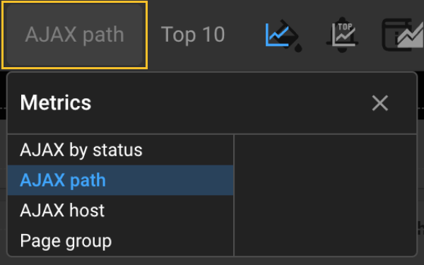
-
From the options on the upper right, select a text that corresponds to the widget's metric. (It is usually located at the third position.)
-
The metrics pop-up window appears.
-
Select a desired item.
Change the data in the graph chart with the selected item.
Checking the top N data
-
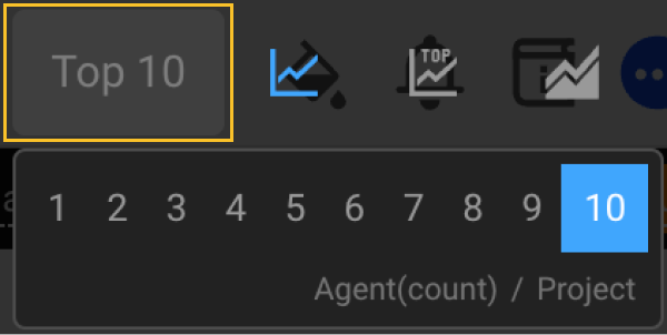
If you click Top 10, you can select up to top 10 items. You can apply the data to the graph chart in ascending order by the selected number.
-
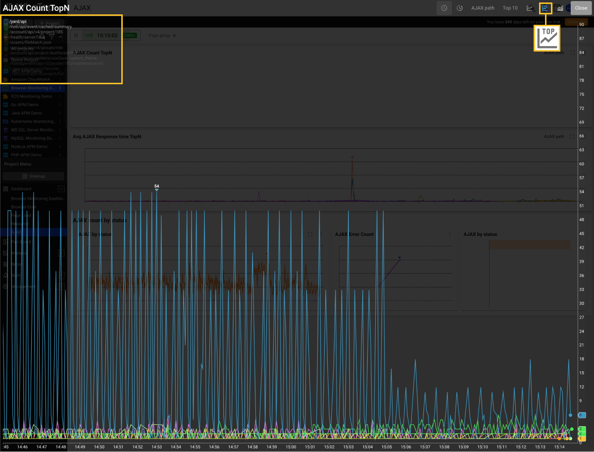
By selecting
, you can display the top N data in the overlay format on the graph chart. To make the top N data disappear from the graph chart, select
.
Checking all data
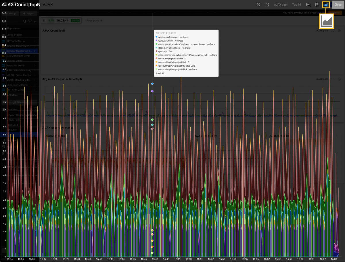
To compare all the data, select . Hover your mouse over the chart to see the figures for each data through a tooltip.
Viewing the data with MXQL
To search data by using MXQL, select . MXQL editing window appears.
For more information about MXQL, see the following.
Changing the table columns
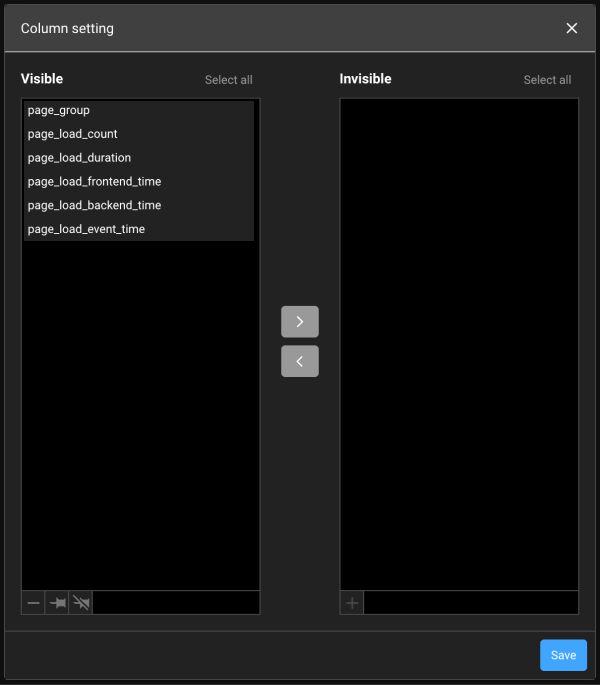
In case of the data table widgets, you can change columns in full screen. Select on the upper right of the table. If the Column Setting window appears, you can hide or add any columns in the table. If you select Save after configuration, the settings are applied to the data table chart.
Configuring the chart
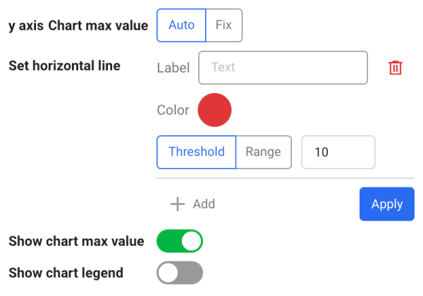
To set the maximum value of Y axis and add the threshold horizontal line, on the upper right of the widget, select .
-
Y-Axis Chart Max Value: You can set the maximum value for the Y-axis by selecting Auto or Fix. If Fix is selected, you can enter a numeric value. If a number is input, select Apply.
-
Set Horizontal Line: Add horizontal lines to the graph chart to set thresholds and monitor them efficiently.
-
Select + Add, enter values for Label and Threshold, and then select a color. In Threshold, by selecting Range, you can set the horizon area. Select Apply to finish the configuration.
-
To delete the horizontal line, select
.
-
-
Show Chart Max Value: Displays the maximum value on the graph chart. It displays the highest number on the chart.
-
Show chart legend: The names of each graph data under the chart widget are displayed. Comparing the graph colors and legends help you understand the chart.